The Complete Guide to National Park Signs
The entrance and associated trail signs are sometimes just as iconic as the National Parks themselves. I’ve always been fascinated with how the NPS uses their color and font schemes to create some of the most noticeable aspects of our favorite parks.
I decided to research where each of these elements came from and to see if we could build a sort of “style guide” for those looking to emulate it.
National Park Service Logo
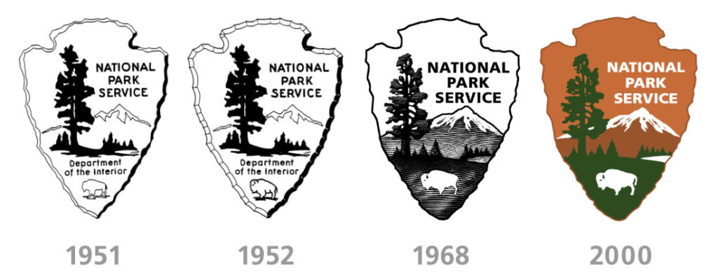
To begin, we need to start with the National Park Service’s arrowhead logo. It actually has a rich history dating back over 70 years!
The logo’s components include an arrowhead, a sequoia tree, and mountains. It is assumed that they are there to represent the natural and historic legacy that the NPS aims to preserve. This has never been confirmed, but we feel its probably fairly accurate.
The original sketch of the logo was created by Dr. Aubrey Neasham, a historian for the western region, around 1950. In 1951, the new director of the region turned the sketch over to internal architects, who created the basis of what is used today. After the design was finalized, the logo became the standard across all NPS signage and publications.
The logo has undergone a few updates throughout the years. In 1952, the logo underwent a slight revision that produced more defined edges and lines, but overall it was extremely similar.
In 1968, the Arrowhead logo was replaced by a more stylized symbol designed by Chermayeff & Geismar.
In 2000, the logo was once again updated. A small design firm by the name of Dennis|Konetzka|Design Group (DKDG) in Washington, DC was selected to update and standardize the NPS style guide. What was created during this process is still in use today. The newest logo actually has a couple of versions. One is a flat line drawing of the logo, the other is more of a 3D version.
NPS Colors

The only official national park service colors we could find are the ones they use to create their latest logo. They are as follows.
| Example | Color Name | Hex Code |
|---|---|---|
| Saddle Brown | #99542C | |
| Chocolate Web | #C56C39 | |
| Hunter Green | #2D4B1E |
NPS Fonts
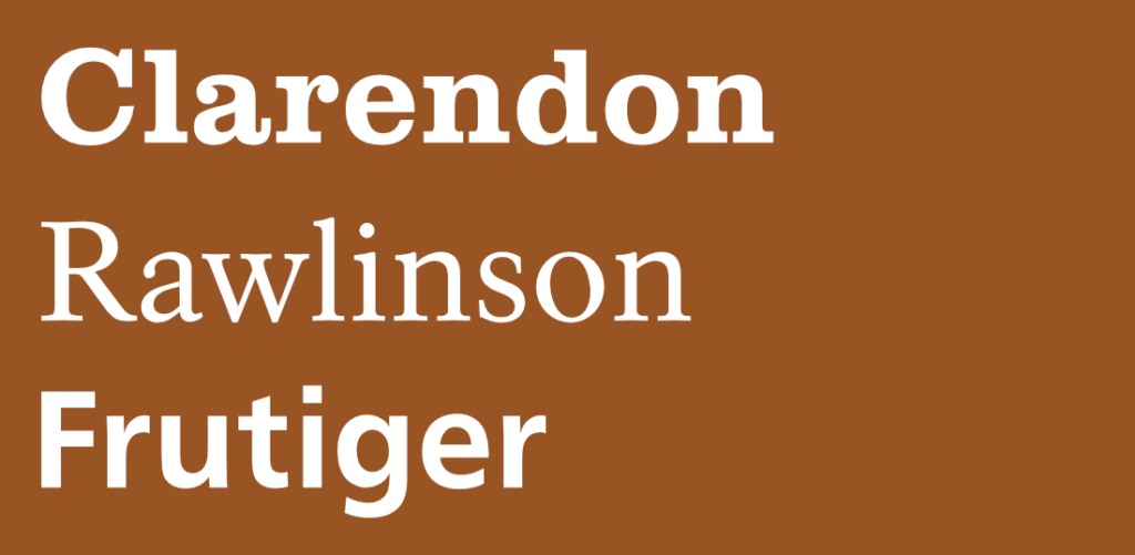
Before the 1990’s, Clarendon (serif) was the standard font used in National Park signage. However, in 2000, the National park Service undertook a project that sought to standardize the fonts used across all their sites. Out of that project, font designer James Montalbano came up with Rawlinson (serif), which was developed to be the main NPS font going forward. It was then paired with Frutiger (sans serif) to give the NPS two distinctive and functional typefaces to which to work with.
Examples of Official NPS Fonts
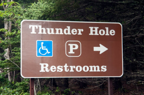
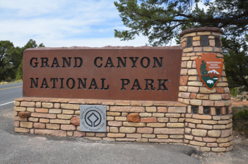
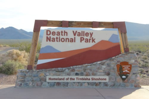
These typefaces can easily be found in the wild. Here are three examples, one from Thunder Hole in Acadia, then park entrances for Death Valley and the Grand Canyon.
Once you know what thee fonts look like, they are easy to spot across various National Park Service signs. However, there are a lot of signs that still don’t use the new standards put in place over 20 years ago.
Non-Standard Fonts
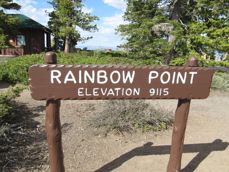
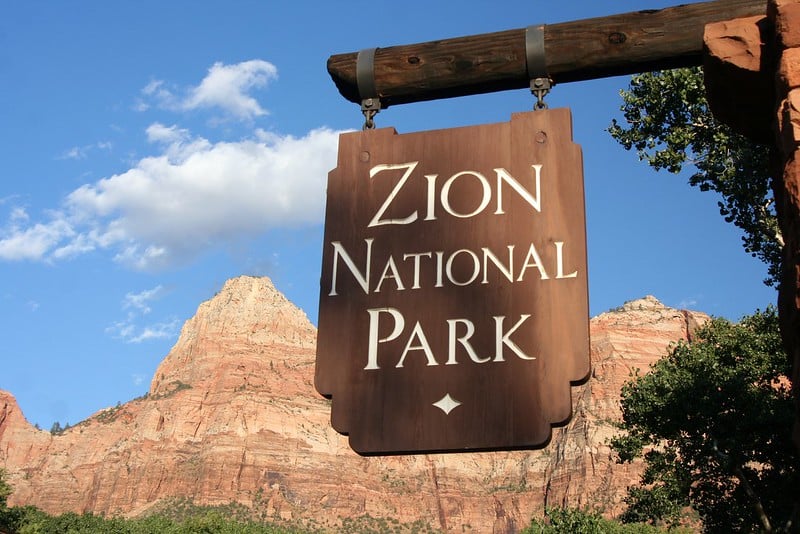

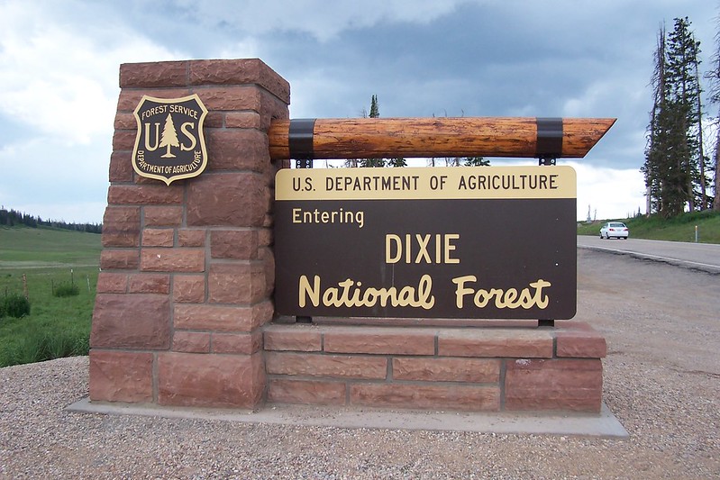
The NPS doesn’t have a great track history of keeping all their signage the same. In fact, up until 1968, every park could use whatever font, colors, or material as they liked. While this contributed to the uniqueness of each park, it also created a sort of branding issue for the service.
You can see this with some of the iconic signs we all know of today.
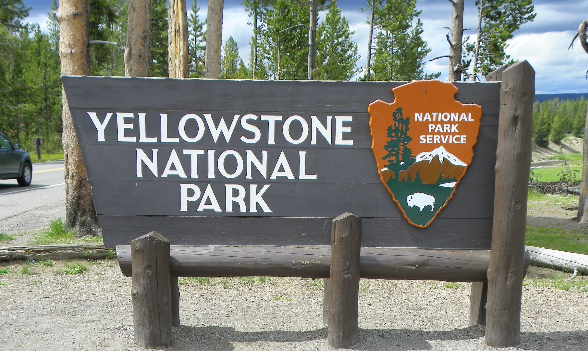
The Yellowstone sign uses a font with barely discernible serifs. The closest match we could come up with was Marcellus SC.
Zion National Park’s sign also uses a font that we cannot find. The closest replica in our opinion is Stoke.
Another well-known font in use by the NPS is the one used on “National Forest” signs. This cursive font is pretty standard on all National Forest and Monument signs. Vibur may be the closest free font I could find to what they used here.
Lastly, there are a few parks that use a rounded font like the Rainbow Point sign in the Grand Canyon. I liken this font to what a handheld router would create. The font the NPS uses here is a bit more stylized, but M PLUS Rounded or Patrick Hand were the closest I could find.
